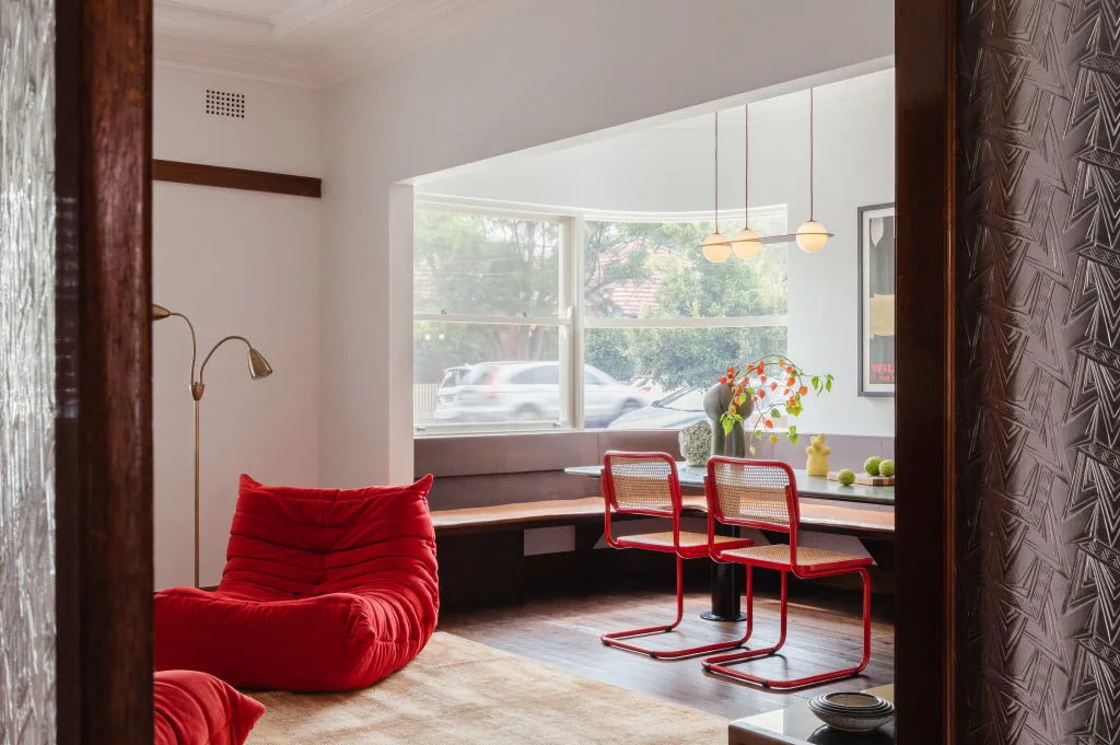
Unexpected Red Theory is pretty straightforward: you add one red item to a room where red isn’t “part of the plan.” It can be a chair, a lamp, a kettle or a piece of art. The point isn’t to redecorate, but to give the room one clear note that doesn’t blend in.
Most of the time this shows up in neutral spaces, beige, cream, light wood, soft greys, because those rooms can start to look like they were built from the same kit. Red cuts across that quickly. You notice it, like your eye has something to return to.
You can scroll past ten neutral living rooms and they all blur together, then one has a red chair or a red lamp and you remember it.
If you’ve ever walked into a calm room and felt like it looked “right” but also kind of interchangeable, that’s the gap this idea tries to fill.
What is the “Unexpected Red Theory”?
People call it a “theory,” but it’s really just a handy label for a simple move: a room stays mostly neutral, and you introduce one red element that wasn’t already implied by the palette. The red isn’t there to match.
“Unexpected” is about context. If the space is already colourful, red won’t read as a surprise, just another colour in the mix. The effect shows up in calm rooms where everything is tonal and coordinated, and the red arrives as a clear exception.
The phrase got popular on TikTok, often tied to interior designer Taylor Migliazzo Simon, mostly because it’s an easy thing to name and an easy thing to spot once you know what you’re looking for.
Where it came from
The trick itself isn’t new. Decorators have always leaned on one bold element to keep a calm room from going flat. What’s new is the naming. Online, everything gets tagged, packaged, and traded as a tiny concept you can carry around.
“Unexpected red” is a particularly sticky label because it’s concrete. You don’t need training to understand it. You also don’t need a budget. One object is enough to test the idea, which makes it perfect for short-form platforms. Quick before-and-after energy, without the actual renovation.
Why it works
Neutral rooms can blur together.
When everything is soft and coordinated, the space starts to feel like it’s made of “good taste” more than actual taste—nice choices, but also safe ones. A lot of modern interiors end up chasing the same baseline: light, clean, inoffensive, photogenic. You’re not doing anything wrong if you like that. It’s simply the dominant visual language of the last decade.
That language didn’t appear by accident. We spend more time looking at rooms on screens than we do sitting in them. Screens reward certain things: brightness, clarity, smoothness, symmetry, low-contrast palettes that don’t fight the camera. Over time, those preferences leak into the way we furnish real spaces. A room begins to aim for “looks right online” before it aims for “feels like me.”
Red interrupts that default with almost no effort.
Part of it is plain contrast. A warm, saturated colour shows up fast against pale tones. Your eye notices it the way it notices a stop sign in a snowstorm.
And once your eye has somewhere to land, the rest of the room gets to relax. This is the small paradox people miss: one assertive detail can make everything around it feel calmer, because you’re no longer scanning the space trying to find what matters.
The more interesting part, though, is what the red implies.
A single red object reads as a choice. It doesn’t try to blend in, and that non-blending becomes the point. Even if the rest of the room is calm, the red element adds a trace of authorship—someone decided this one thing gets to be itself.
That’s why the theory lands beyond interior design. It fits the bigger cultural mood: we’re surrounded by templates. The safe playlist. The safe outfit. The safe opinion. The safe, minimal apartment that could belong to anybody in any city. A small red detail works like a tiny refusal of the template.
If you’ve ever walked into a beautifully neutral space and felt strangely untethered, that’s what’s happening. Without a focal point, your attention just slides across surfaces. Nothing catches, the room looks good, but it doesn’t read.
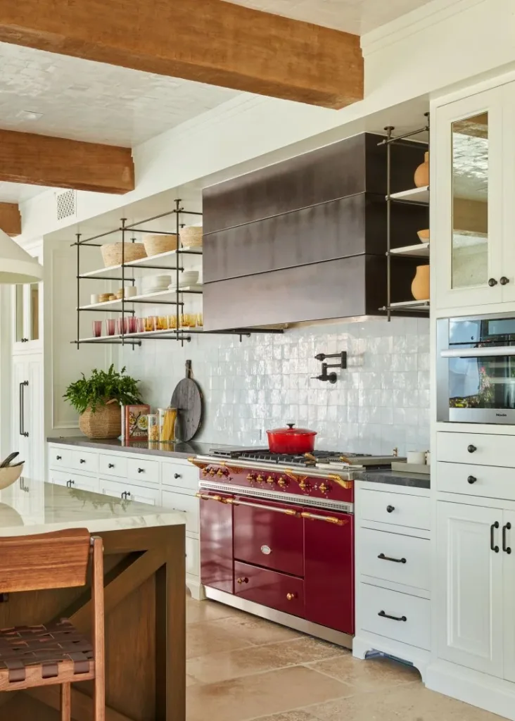
One more nuance: “unexpected” doesn’t mean random. The red still needs to belong in the room in some way—through material, shape, scale, or placement. A red metal chair can work in a soft room if the lines are clean. A red ceramic mug can work on a neutral counter if the rest of the objects feel lived-in, not staged. The surprise is mostly about colour, not about chaos.
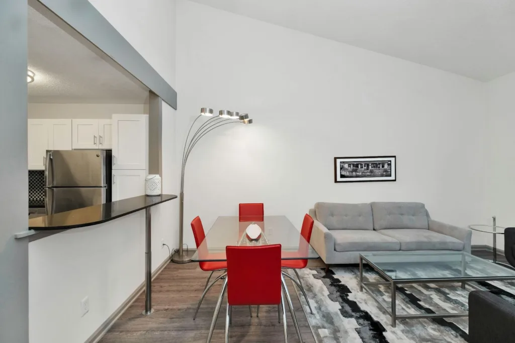
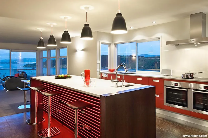
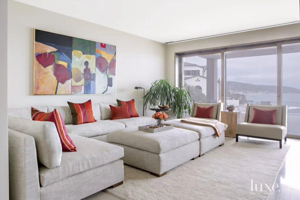
A few examples
Notice what’s absent from these scenes: matching sets, coordinated themes, “decor moments.” They’re ordinary. That’s the point. The red isn’t performing. It’s just there, holding the composition together.
Conclusion
What I like about the “unexpected red” idea is that it doesn’t ask you to rebuild the room. It just highlights something that’s already been happening: a lot of interiors are designed to be safe first, that looks good in photographs, and it travels well. The trade-off is that it can start to feel generic.
A red detail cuts through that. Red is warm, intense, and basically impossible not to notice, especially against beige, cream, pale wood, and soft grey. So if what you want is a clear, marked contrast—something that reads as a choice, not a default—one contained red element does the job fast.
Our Pinterest inspiration folder: https://br.pinterest.com/innergrowthh/unexpected-red/
Ane Campos.
I am a lawyer and a Digital Law specialist with over 10 years of experience in social assistance. My professional background allows me to bring a unique perspective that connects personal development, emotional resilience, and the impact of the digital world on self-esteem and clarity of purpose.